The living room is more than just a space for relaxation or entertainment—it is the heart of your home where energies converge. According to Vastu Shastra, the ancient Indian science of architecture and design, the colours you use in your living space can significantly influence the energy flow within your home.
Each colour carries its own vibration, and when applied thoughtfully, it can enhance harmony, positivity, and well-being. Choosing the right interior wall colour for your living room, as per Vastu, can help create a balanced and welcoming environment.
How Are Colours Significant?
Colours are more than visual elements; they impact mood, mental health, and even the energy in a space. In Vastu Shastra, each direction is governed by a different element—earth, air, water, fire, or space—and the colours used in those areas should align with the respective elements to bring balance and peace.
For instance, the north is associated with water and suits cool colours like blue, while the east, linked with air and freshness, welcomes light hues like green and cream. When colours are chosen in harmony with these directions and principles, they can help maintain the energy equilibrium within your home, promoting health, prosperity, and happiness.
Vastu Approved Colours
If you’re redecorating or designing your living room, consider these Vastu-approved interior wall colours to infuse your home with positive energy and aesthetic elegance.
White
White symbolises purity, peace, and clarity. It reflects light beautifully and opens up the space, making the living room feel airy and serene. According to Vastu, white is ideal for homes that need more light and calm. It promotes mental clarity and emotional balance, especially when used on the north or northeast walls.
Brown
Brown, associated with the earth element, creates a grounded and stable feeling. It adds warmth to the living room without being overwhelming. As per Vastu, brown represents reliability and resilience, making it an excellent choice for a family space where stability and connection are key.
Cream
Cream is a gentle neutral that brings a sense of softness and comfort. It blends well with a variety of decor styles and complements wooden furniture, making the room look elegant yet understated. In Vastu, cream is considered a balanced tone that neither excites nor dulls the energy of a space, making it ideal for living rooms meant for relaxation and family time.
Light Blue
Light blue symbolises tranquillity, openness, and trust. It is a calming colour that reduces stress and fosters communication. Vastu recommends using blue in the northwest direction to promote calm and harmony, especially useful for social areas like the living room, where conversations and interactions occur frequently.
Light Green
Green represents growth, freshness, and renewal. In Vastu, it is linked to the east direction and the element of air. Using light green in your living room can create a rejuvenating atmosphere and invite feelings of balance and vitality. It also works well with natural materials and indoor plants, reinforcing a connection with nature.
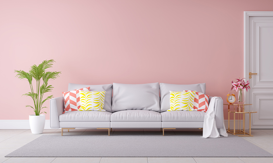
Pale Pink
Pale pink is associated with love, compassion, and warmth. It introduces a gentle vibrance to your living space without being overpowering. According to Vastu, pink is suitable for walls in the southeast direction, where it enhances affection and emotional comfort. This makes it a lovely choice for families that value emotional bonding and intimacy.
Yellow
Yellow radiates positivity, cheerfulness, and intellectual clarity. It is linked to the fire element and is best suited for the east or northeast directions in your home. In the living room, yellow can energise the space while also encouraging friendly conversations and a bright outlook. It is particularly beneficial in rooms with limited natural light.
Orange
Orange symbolises enthusiasm, joy, and creativity. In Vastu, it is considered a powerful colour that stimulates activity and liveliness. While vibrant orange may be too intense for all walls, softer shades can bring warmth and vitality to the living room, especially when used as accent walls or paired with neutrals.
How to Pick the Right Colour as Per Vastu
Selecting the right interior wall colour based on Vastu doesn’t have to be complicated. Start by identifying the direction your living room faces, as this plays a central role in determining the appropriate colour palette. North-facing rooms benefit from cool and light hues like white and blue, while east-facing rooms thrive with tones like green and yellow.
Also, think about the overall atmosphere you want to create. If your goal is peace and relaxation, go for softer, pastel tones. If you’re looking to energise the space for social gatherings and celebrations, choose colours with warmth and vibrancy.
It’s also important to maintain colour balance. While Vastu allows for flexibility, overly dark shades are generally discouraged as they may attract negative energy or create a heavy ambience. Use bold colours in moderation or as accent elements, ensuring they complement the lighter base tones.
Lastly, the choice should reflect your family’s preferences and lifestyle. Vastu is about harmony, not strict rules, so any colour that brings joy and comfort while aligning with directional energies can be considered auspicious.
Conclusion
Choosing a Vastu-approved colour shades for your living room is about more than aesthetic appeal—it’s a way to invite positive energy, harmony, and comfort into your home.
Whether you prefer the soothing effect of light blue, the nurturing presence of green, or the uplifting nature of yellow, aligning your colour choices with Vastu principles can help create a space where everyone feels at ease.
By combining thoughtful colour selection with personal style, you can design a living room that’s not only beautiful but also brimming with positive energy and warmth.